Web Catalogue Design
The Catalogue Project, initiated by Converge2Digital, presents an innovative opportunity for small businesses to acquire a professionally designed UI/UX website at an exceptionally affordable price point. I have worked on 40+ catalog website templates for different fields and also have worked on the CMS Dashboard.

Context and Problem statement
Context
Catalogue designs for Small businesses in France
The Catalogue Project, initiated by Converge2Digital, presents an innovative opportunity for small businesses to acquire a professionally designed UI/UX website at an exceptionally affordable price point.
Converge2Digital, a burgeoning startup based in France, specializes in delivering digital solutions tailored for startup enterprises. Recognizing the indispensable role of a website in establishing brand credibility, we have curated a unique offering that focuses on providing website design solutions specifically crafted for small businesses. Our approach revolves around empowering entrepreneurs to seamlessly edit, visualize, and ultimately publish their websites.
Problem
Creating a UX Designed website
Although there are many different platforms available currently where a small business can use those platforms for creating their own website. But they need to put time for layout / selection of colours, content etc. The main reason this is not possible because of time as a factor.
There will be many websites and must be launched in super quick time like a week.
Quick Development
The tool must be able to assist us to make decisions by visualizing a template with colors, logo etc.
Customize to make decisions
SUMMARIZING MY PROCESS
I did some research to better understand this business and Industry, also globally I had to understand how this catalogues work.
My research process was primarily checking out competitors in this space, researching on simplified UX and UI design solutions and speaking to business owners to know their perspective
Understand
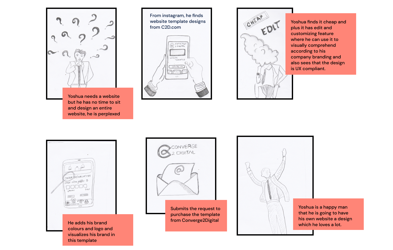
Based on my understanding and insights from research, I defined Yoshua’s our user personas need and painpoints.
This gave us an understanding as to what the needs of the user is and to start working on solutions
Define
This was where Ideated on how to solve this problem. Based on my research understanding and goals defined, I sketched out different Ideas on how to solve this on paper
Brainstorm/Ideation
Visually represented my solution clearly showing the options for yoshua to have a website yet dont have to worry about time, cost, security and back up. Also did a quick prototype to show how the dots connect
Design
DISCOVERY - WHY THIS IS IMPORTANT
This theory states that the type of communication which has more ability to convey a meaning to one person depends on the interactivity and feedback.
Media Richness Theory

So from this theory what we understood is that we need to create the website as interactive as possible. That will encourage users to have better richness of content.
Ease of use, template visibility, comprehensive filters, colour management, find by tags, template editing, visually appealing.
Efficiency
Giving Yoshua a website that would allow him to have digital visibility for his product. If the website also can take care of security and maintenance. Yoshua feels that the company can grow more trust in the industry.
Growth
REPRESENTING YOSHUA AS A PERSONA

Grosses over 50000 Euro
Annual Revenue
Merchant (Make up Salon Owner)
Yoshua
Yoshua is a merchant on that earns over 10000 Euro, without a digital presence, what he needs is a website where he can create more credibility and awareness about the company's digital presence. He runs this business for more than 15 years and he has good knowledge on digital transformation and is hoping that he would find a right tool which could help his company to digitally be available.
About Yoshua
Time: Yoshua does not have time. As a small business owner, he needs to take care of business. When it comes to designing a website, a dedicated person is needed to create the layouts, add content, and find images.
Maintenance: He is unable to maintain even his social media platforms, and what if something wrong goes in his website, who will take care of the next steps to bring the website up?
UX Design: Without a good interaction in the website no one would love to see. He has seen a lot of websites although there is a digital presence it doesnt look good or work good.
Backup and Security: Especially small businesses in France faces a lot of security issues like hacking, phishing etc, yoshua is scared that his website also would be hacked.
Top 4 Painpoints
Conceptualizing THE GOAL/OBJECTIVE
A linear theory was deviced after understanding from the Media Richness theory that if a design has good feedback mechanism to the users and if the user can interact well this leads to a good user experience there by communication becomes successful.
The goal of this project is to design a platform that can help users like yoshua to find website templates that would suit their products and checkout with security, maintenance and cheap in costing.

BRAINSTORMING - CREATING SOLUTIONS
SOME DESIGN CHALLENGES FRAMED AS Hmw’s
How might we provide Yoshua with clear and accessible webstites which can be of feasible costing ?
HMW provide Yoshua with features that can help him to find templates that would suit his product?
How might we give yoshua a seamless experience of customizing the template to make a decision to buy the template ?
How might we simplify the process of giving Yoshua a website with Maintenance and security along with the website ?
How might we provide Yoshua with a design published in 2 weeks time? Sustainable products?
How might we make it easy for yoshua to maintain the website on his own by adding contents and images and also if he wants to add more pages without disturbing the cost?
How might we help yoshua to recreate own a template with a complete UX designed website ?
BRAINSTORMING - CREATING SOLUTIONS
White labeling is the process of rebranding a single product or service for multiple companies to sell as their own. White labeling benefits the manufacturer and the reseller.
Introducing “WHITELABELLING”
So we tried whitelabelling for us by creating and adapting two global design systems which has multiple variants of UI layouts and components.
The solution for cost effective templates were:
Component Flexibility: Creating a huge component library.
Layout modules: Layouts are specific designs but with the components. Atomic design theory.
Atom creation: Atoms are created and approved by the team.
Theme based: Every design will be themed. Layout based, but visually to be presented different.
While researching to prepare low cost UX designed templates, we found out options where one can hire UX Designers at a cheaper cost to do the study.
UX Design for every project is the toughest part because it involves research and finding solutions.
1. Low cost UX designed web templates
We also thought of giving features that would cost us less to create and develop.
Another idea which we thought was to create template pages where the user can duplicate the template and use it for creating more pages.
BRAINSTORMING - CREATING SOLUTIONS
The IKEA effect is a cognitive bias that describes how people tend to value objects more if they make or assemble them themselves. The name comes from the Swedish furniture retailer IKEA.
The I

From the IKEA Effect, we can understand users needs to arrange things on their own to make decisions more effectively. So we introduced the IKEA effect in partially customizing the website to make decisions.
Template customization majorly involves 3 things
-
Adding images
-
Changing layouts
-
Adding content
2. Template Customization for decision making
The partial customization involves
-
Adding logo to the website to check how the template suits their logo
-
Color customization where the user can select colour palettes which are predefined to check.
-
Brand name addition which will reflect in the content.
-
Change of header and footer from the list of header and footers which we have designed.
BRAINSTORMING - CREATING SOLUTIONS
Cyber attack has grown more in the recent times and also in France it seems to be growing more. So, how do we solve this problem for the small business owners.
2. Securing & Maintaining
How might we simplify the process of giving Yoshua a website with Maintenance and security along with the website ?

Securing the design is the most important aspect in this time. We had to work on automated rules weekly that could back up the designs so that if there was a cyber attack, the restoration could be done very easily.
When it comes to maintaining the content of the website, the backend is WordPress where with one training, yoshua can add images, content and updates on the website on his own like adding content to social media.
Fortunately the management team in our company were security experts. They gave us solutions which were very feasible to secure the design and development through automatic scheduled 3-2-1 back up rule.
BRAINSTORMING - CREATING SOLUTIONS
The goal of this project is to design a platform that can help users like yoshua to find website templates that would suit their products and checkout with security, maintenance and cheap in costing.

CUSTOMIZATION FEATURE
How might we give yoshua a seamless experience of customizing the template to make a decision?
Yoshua can view the template from the list of colour palettes available. The colour palettes are provided by the UI Designers that are fitting the template designs.
Multiple footer and header options were given so that yoshua can select the suitable footer and headers for their website. He also can view the website by adding his logo and company name which helps them to decide whether this template looks fine for his brand.

TEMPLATES FINDING & SELECTION
How might we give yoshua a seamless experience of customizing the template to make a decision?
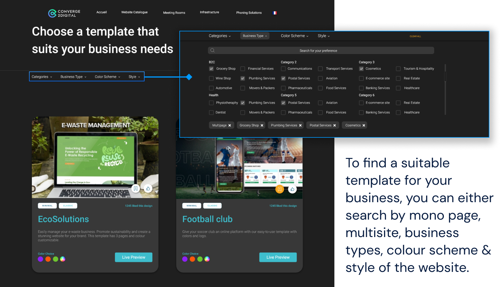
Adaptive design format was followed for this design. The filter layout is different from the website to the mobile version. Yoshua can select his template by browsing through the templates or directly searching for the category in which he wants templates.


WHITELABELLING DESIGN
Initially we thought of designing templates for small business solutions and we worked on UX designs of around 40 responsive designs in different category of business.

CATALOGUE MANAGEMENT PORTAL

HMW manage the projects which the client has selected?
HMW understand the revenue generated and client management?
SECURITY MEASURES FOR BACKEND PORTAL
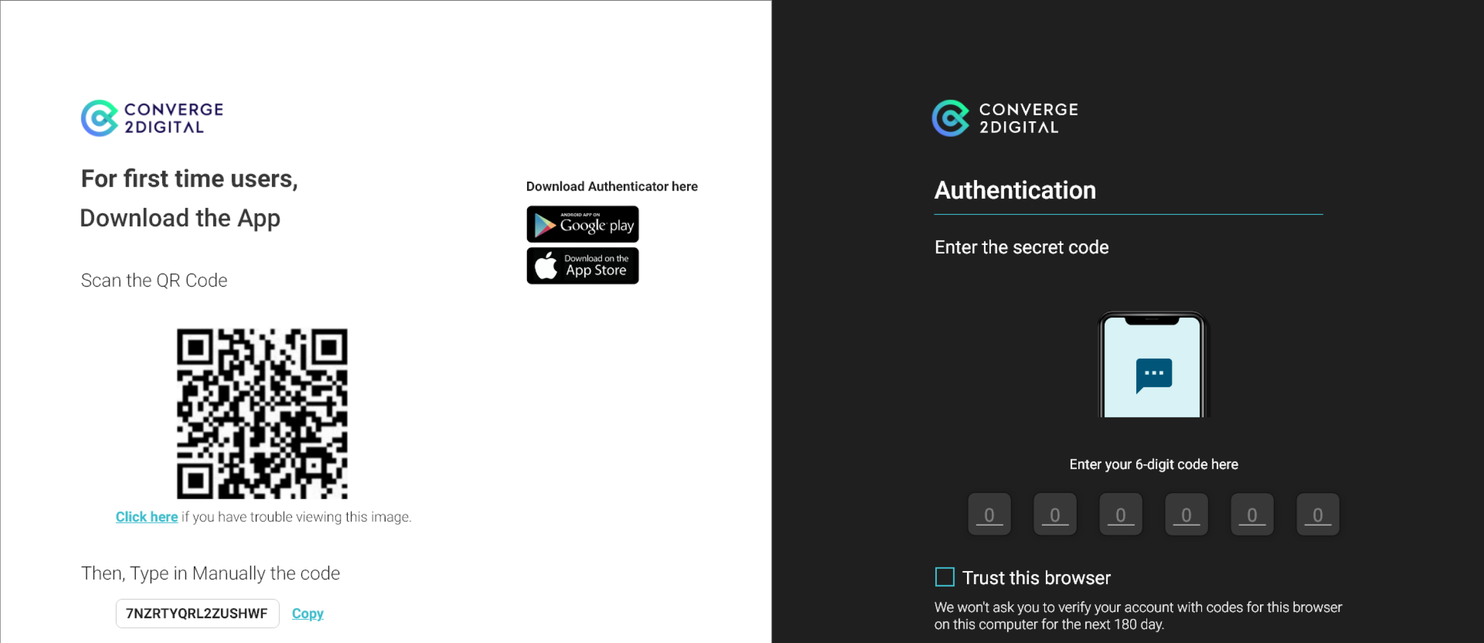
How might we make the login secure for the back end because it has all the data of the users and the information on their complete requirement?
Single factor authentication method was used at the back end portal side where to login, the user must enter the 6 digit code generated by the authenticator tool which they have to logon.

SHOWING YOU MORE TEMPLATE DESIGNS
Templates that were made with UX Design study.

OTHER FEATURES FROM BACKEND PORTAL
Our focus lies in the meticulous management of comprehensive data at the backend, ensuring that the search results precisely align with Yoshua's requirements. Our efforts encompassed efficient tag management and systematic data feeding from the backend to proactively generate accurate and tailored search results.
How might we help yoshua to find the desired website according to the business which he is in?

MOBILE OR WEB?
All website components and templates boast fully responsive designs. Our primary design approach revolves around the concept of "Mobile First Layout," initiating the creative process by prioritizing the mobile user experience.
I created a mobile responsive view to highlight the fact that yoshua can be able to do all these from his mobile or other devices

TO SUMMARIZE
The goal of this part of project was to design seamless UX designed websites which would suit the small business companies in france.
A Whitelabelling design format with a comprehensive design system was made
Website templates
The functionality of the catalogue is for the users to find, customize, and submit the templates which they like
Catalogue Website
As a collaborative team, we dedicated 10 months to this project, resulting in the successful creation of over 40 website templates, a robust backend portal, and the design of the catalog website inclusive of a seamless checkout process.
A portal to upload templates from the companies side as well as manage / maintain leads that are generated through the catalogue website.
Entire requirement management of the templates selected by the customer.
Revenue generated charts to understand the amount of money generated from each and every catalogue project.
Backend Portal
TESTING
A hundred day testing was done manually and the bugs were reported on JIRA and was solved in 100 days. The current launch version is 1.0 which is the preliminary version.
Internal test
Yoshua was happy to see the designs and even bought one layout from the company.
Test with yoshua

Customized UX Website: a solution that is researched about his own field and is designed. Which also could be customised according to his taste.
Security and back up: He wants the website to be secure, regular backups should be made so that the website even if someone hacks, can be up and running with the back up which has been made.
Self Maintained: After publishing the website he doesn't want to go to the company again and again for correcting small stuffs and adding images in the website.
Cheap: Yoshua is running a small business, he doenst want a costly solution like what wordpress provides. He wants simple yet efficient design.